Featured case study
Graceful Hearts Birth website redesign.
A warm, complete service experience that helps families understand support, explore resources and service areas, and reach a clear inquiry path.
- Client
- Graceful Hearts Birth
- Project type
- Small-business service website redesign
- Industry
- Doula and lactation support
- Region
- DFW / Rockwall County
- Live site
- gracefulheartsbirth.com
Project overview
A stronger structure for a meaningful service.
Graceful Hearts Birth supports families through pregnancy, birth, postpartum, and feeding questions. The redesign needed to preserve the established brand and photography while making the breadth of that support much easier to understand.
The challenge
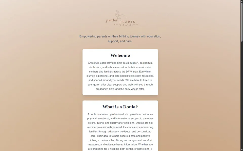
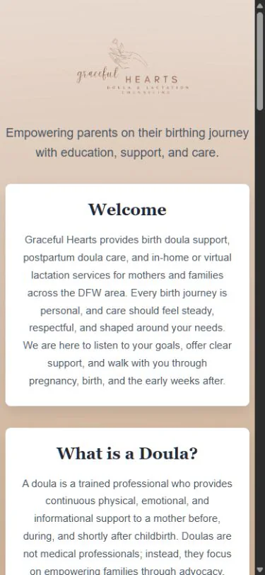
The original site contained useful service information, resources, local service-area links, and a contact form, but the experience was constrained by a narrow stack of visually similar cards. Visitors had limited navigation, little service detail, and few cues guiding them from initial interest to an inquiry.
The goals
Preserve what mattered. Improve what visitors needed.
- Preserve the existing brand and photography
- Create stronger information hierarchy
- Make services easier to understand
- Improve desktop and mobile presentation
- Add clear navigation
- Strengthen the inquiry path
- Preserve local service-area content
- Maintain a lightweight static architecture
- Improve SEO, accessibility, and maintainability
Design approach
Warm, editorial, and easier to navigate.
The new interface uses a warm editorial layout and more deliberate typography to communicate calm, established support. Alternating content structures replace a repetitive card stack, giving each part of the service a clearer visual role.
Strong service routing, mobile-first navigation, and a more complete footer and contact experience keep useful destinations available throughout the site. The client's existing photography and brand assets remain central to the experience.
Technical implementation
Lightweight delivery with documented infrastructure.
The site stays intentionally static and uses minimal JavaScript only where required. Clean URL routing and responsive imagery support a fast, maintainable public experience.
- Static HTML and CSS
- Minimal vanilla JavaScript
- Responsive WebP imagery
- Formspree contact handling
- Amazon S3
- CloudFront
- Route53
- ACM
- OpenTofu
- GitHub Actions
- Clean URL routing
- SEO and structured metadata
Before & after
The complete interface, not a selective crop.
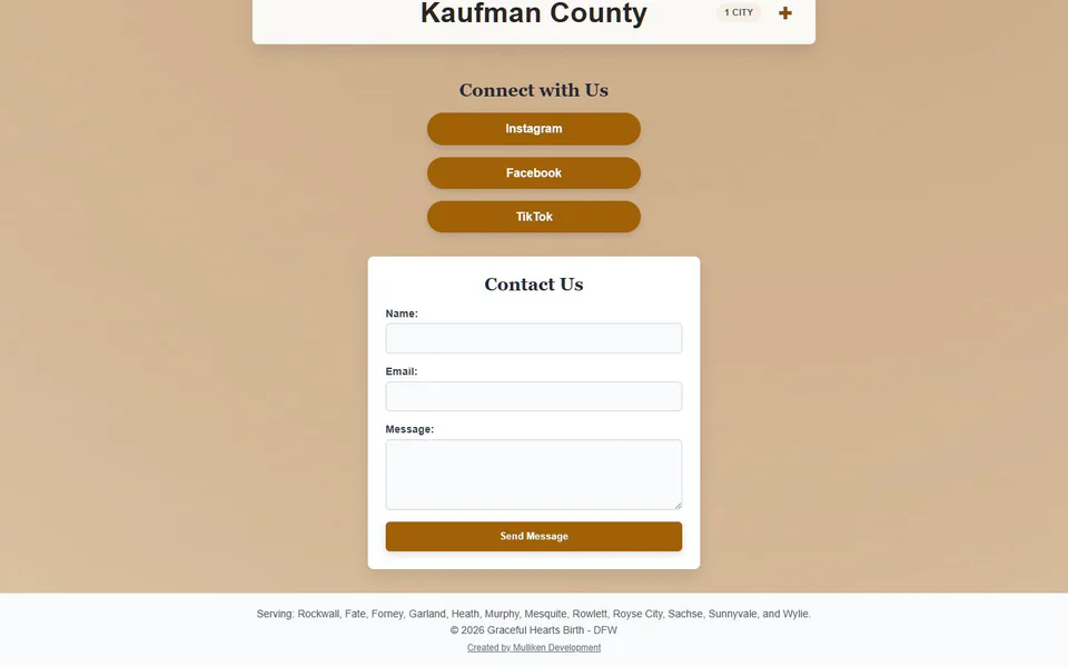
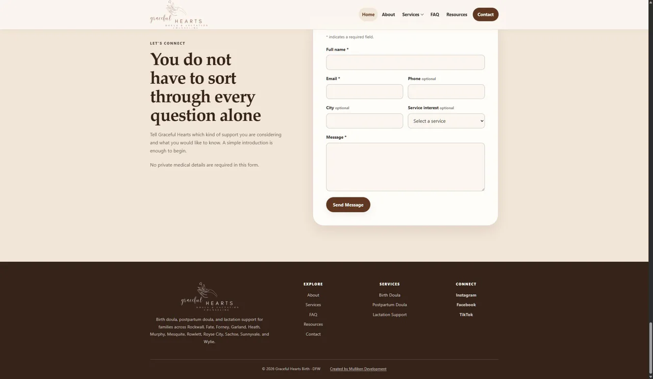
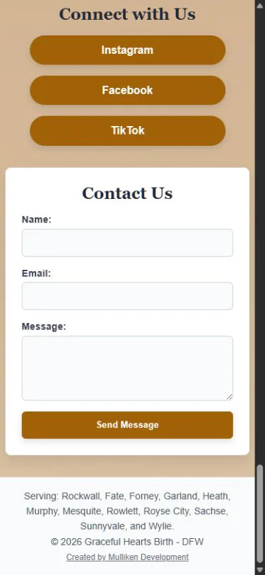
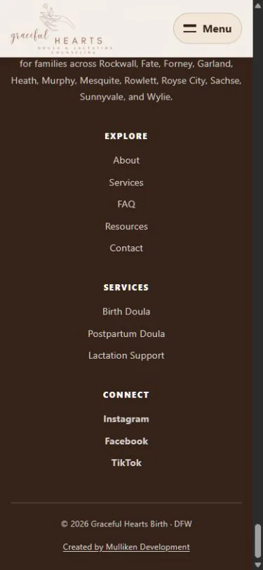
Each comparison shows the original and redesigned experience at the same general point in the visitor journey. Both images remain fully viewable without interaction.
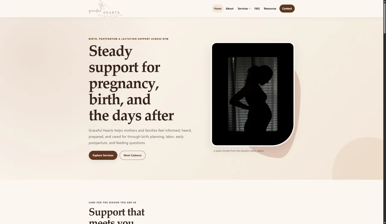
1. Desktop homepage top
The redesign adds complete navigation, a clearer service promise, and a more deliberate visual hierarchy.
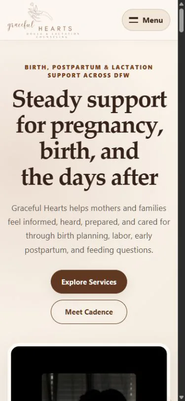
2. Mobile homepage top
The mobile experience now establishes the brand, promise, navigation, and first action within a clear responsive composition.
3. Desktop contact and footer area
The finished desktop experience ends with a visible contact path, useful navigation, and complete business context.
4. Mobile footer and navigation area
The final mobile route keeps service, resource, area, legal, and contact destinations organized at the end of the page.
Outcome
A service business that feels complete online.
The finished site presents Graceful Hearts as an established, trustworthy service business. Visitors can now understand the available support, learn about the provider, explore FAQs and resources, navigate service areas, and reach the contact path from a consistent desktop or mobile experience.
This is a qualitative description of the finished experience. No claim is made about conversions, traffic, revenue, performance scores, or inquiry volume.